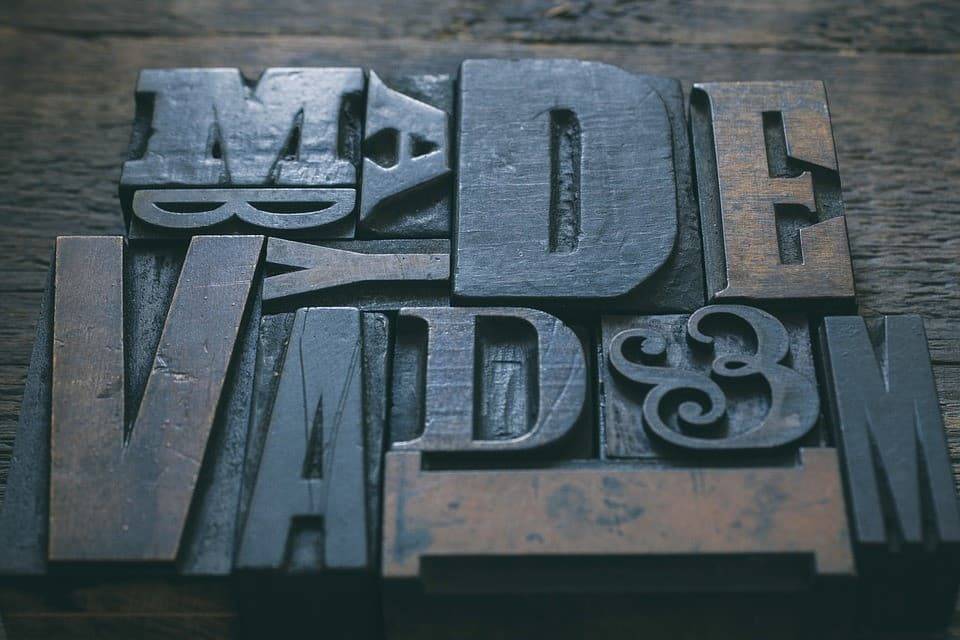
Web designers and people who put together their own website by hand-coding or using WordPress often don’t really understand typography. Unless you’ve studied graphic design, it’s not really too surprising. Typography is essentially the way that numbers, letters, and all other characters appear on the screen.
Many people have little experience knowing what to do with typography to get the best results and tend to throw a lot of proverbial (font) paint against the wall and see what sticks. Bad idea.
Here we run through a few suggestions on how to use typography in web design for better and improved readability.
Don’t Get Too Flashy. Use Standard Available Fonts
We’ve all seen those sites that take an age to load. One of the reasons is if they’re using a non-standard font that are not usually already installed on the internet-ready device being used to access the site. For example, a Star Trek related site might use a Klingon language font that isn’t present on most devices (only universal translators)
Fortunately, the good folks at Google have you covered. Several years ago, they put together a set of several hundred usable fonts that have been downloaded into most web browsers at this point. Many WordPress themes arrive with several hundred of these Google Web Fonts pre-installed for use on a site making it easy to select between them. Other platforms like Typekit have also made similar arrangements to standardize the number of fonts available to all users.
Never Met a Font You Didn’t Like
When you cannot decide what font to use or you think that more is better, it’s tempting to overload a page with six different fonts in different styles and font sizes to G R A B the attention of the visitors before they leave. The trouble with this approach is that it looks unprofessional and jarring. Using one front that has a slim width and another with a wide width also looks odd. Most likely, visitors will leave in droves when facing numerous fonts or ones that don’t look right together. Visitors need visual consistency in the way they’re being presented information. It confirms that they’re still on the same website and makes it far easier for them to consume information quickly.
It’s quite possible that either an article headline or a heading uses a different font to the one used for the main content. The same rules apply here. Look for fonts that complement each other. Two fonts should look like they go together well. If there is a jarring visual difference between one font and another, make a different choice so that the eye can move down the page smoothly without any unnecessary visual distraction.
Test That the Font is Readable in Smaller Sizes
While the site will use a relative font size based on the settings in the visitors’ web browser, it’s important to check whether all the fonts used are readable at smaller sizes. Some serif fonts and cursive ones that mimic human handwriting (like the Vivaldi font) tend to become unreadable at smaller font sizes and should be avoided.
White Space is Still Your Friend
Leaving enough white space between lines and paragraphs is just as important as the font that’s been selected. The line height (otherwise known as leading) determines the white space between each line within a paragraph of text. When text is bunched up too closely together, it makes it more difficult to read quickly. The leading is usually set to around 30-35% of the height of the characters to get a decent amount of white space.
Choosing the right fonts and using different font families sparingly makes it easier for visitors to consume the information on the web site. Over complicating the visuals only serves to confuse and slow down visitors achieving their goals, whether that’s reading an article or learning enough about a product to choose to buy it.
